Building a brand
for accessibility
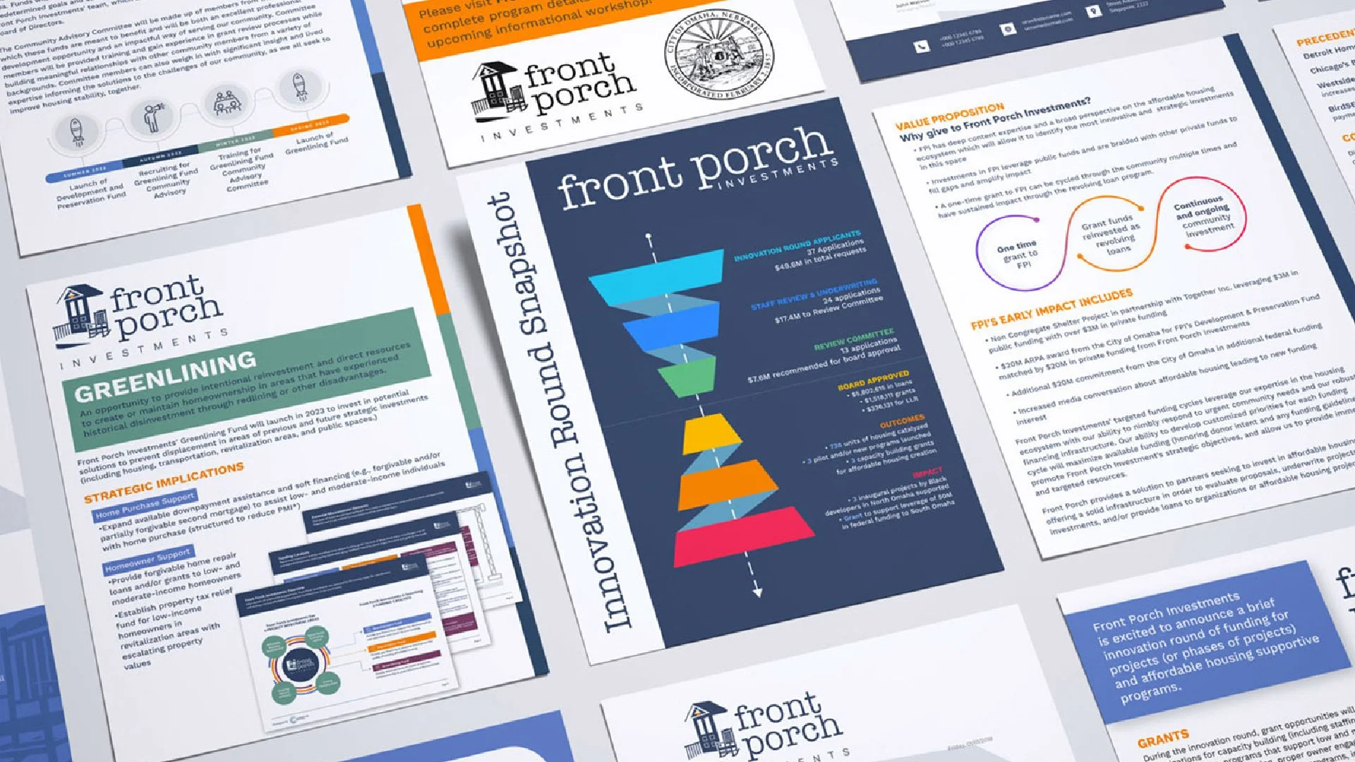
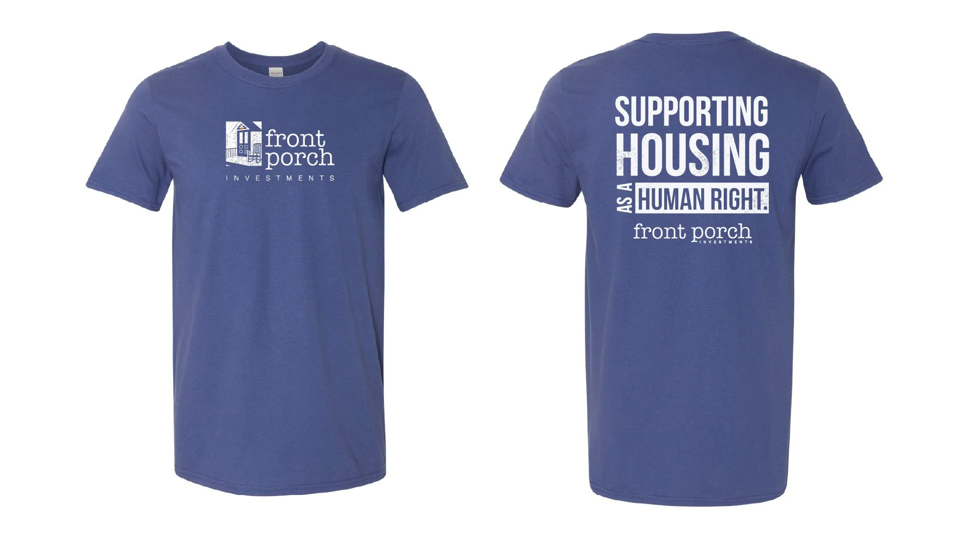
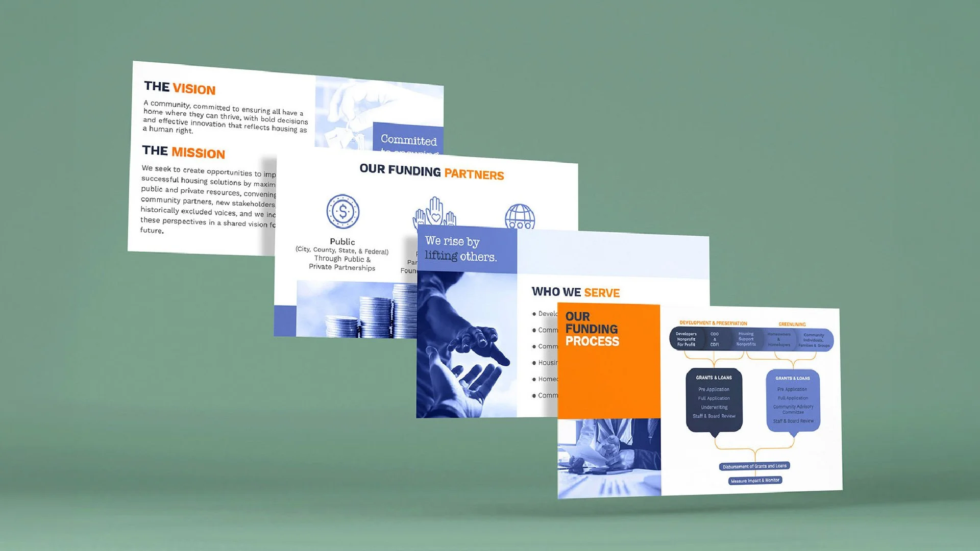
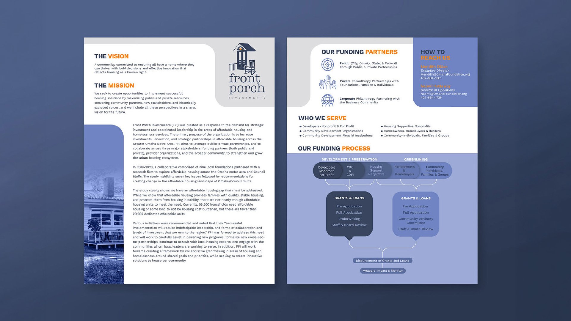
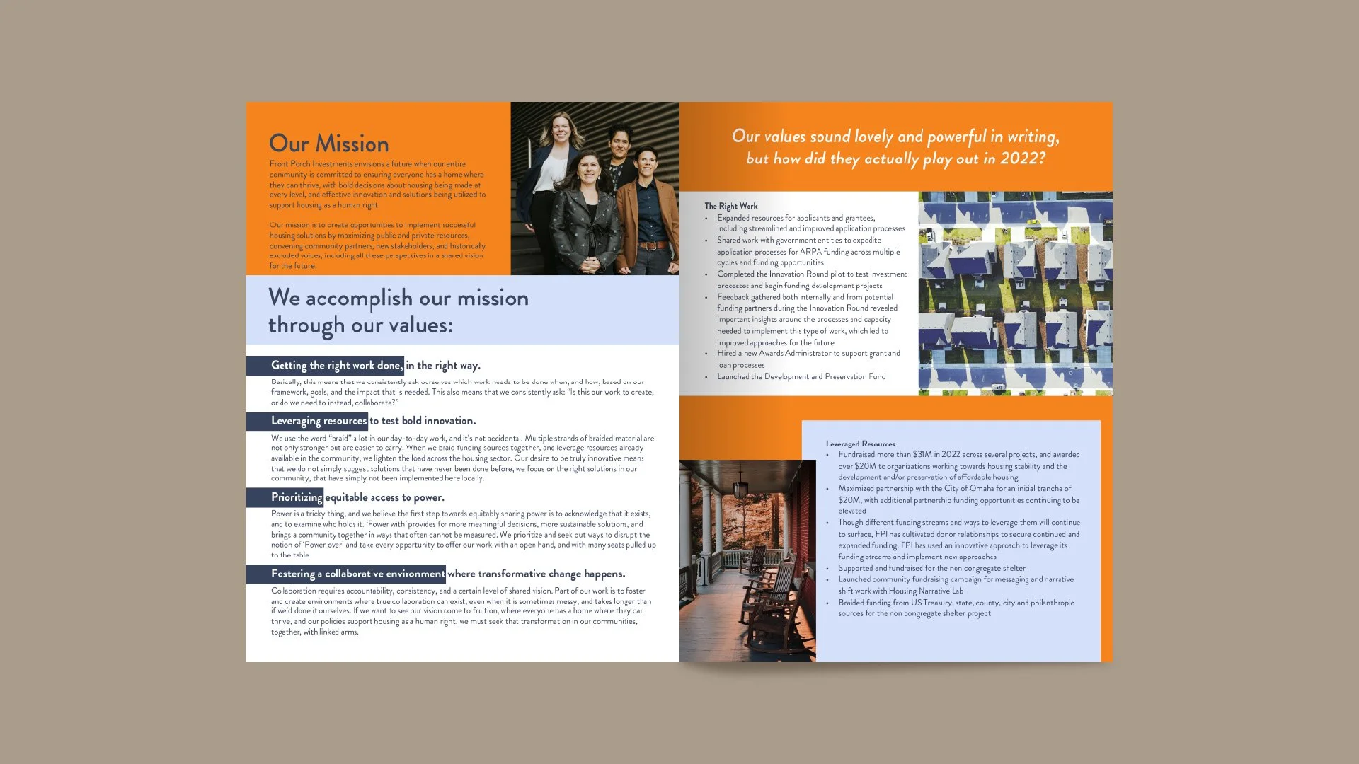
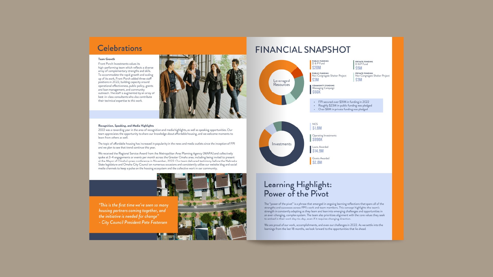
Front Porch Investments provides access to affordable housing and champions homelessness prevention. For this client I had the pleasure of leading not only the logo design and development of brand guidelines, but curating an entire suite of informational graphics and pamphlets.
Because of the grassroots nature of this organization, design wasn’t the only part of my creative process. I also spent a great deal reviewing copy (sometimes handwritten!) and data to determine how to best illustrate information and make it easy to understand for even the most novice reader.

Home is where you make it
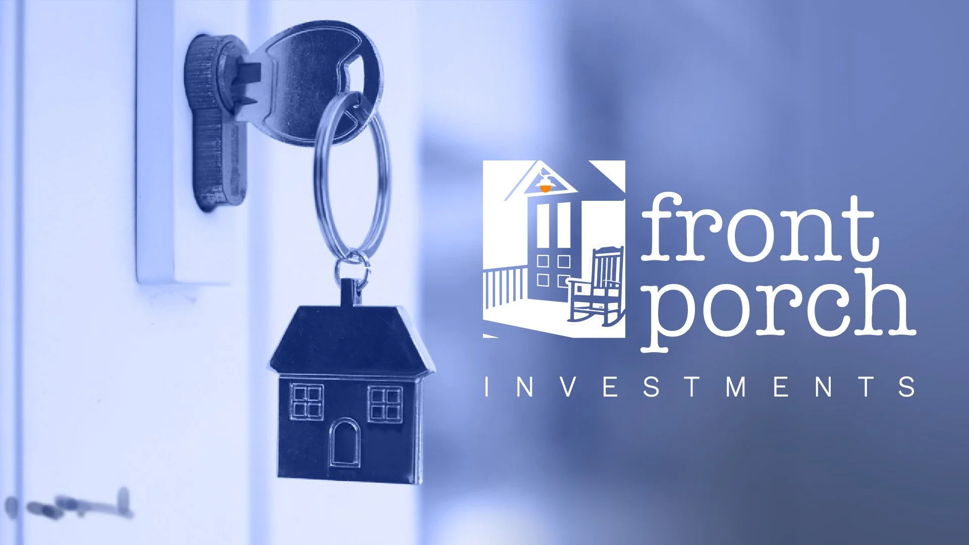
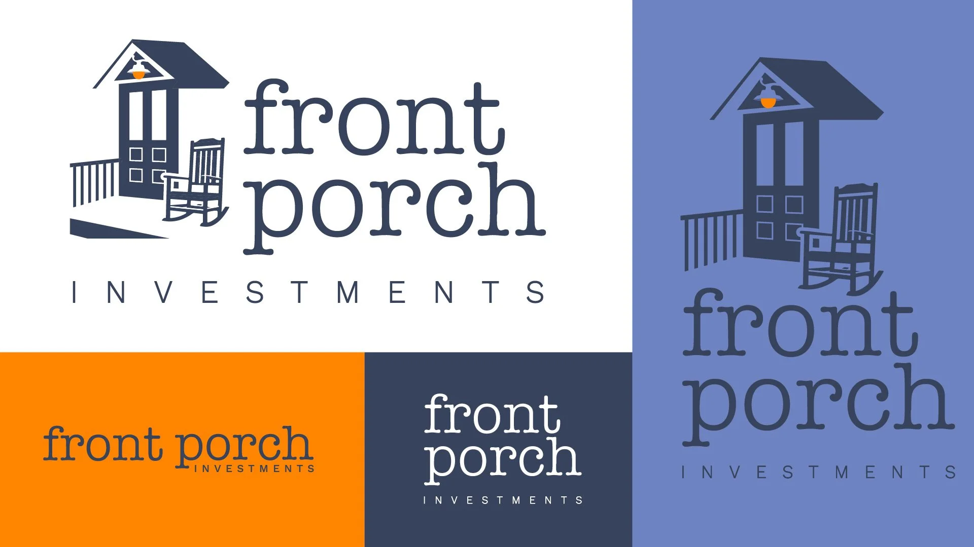
The porch meant something specific to this client, it wasn't just a literal nod to the name. It represented ownership. The feeling every resident deserves when they're searching for a place to call home.
Old architectural details were important to communicate that sense of community and rootedness. Porches have always been gathering spaces. There was a time when being outside your home was just what you did. You'd sit, neighbors would pass, conversations would happen naturally. That culture of community built around simply being present on your own property is something that's faded, and this brand is rooted in bringing that feeling back.
The rocking chair carried the weight of rest, pride, and ownership. This is your home. You should be able to sit in it, enjoy it, and feel at peace and that's exactly what Front Porch is trying to give people.
The porch light ties it all together. That small orange glow at the top of the mark represents hope. A guiding light for people searching for affordable housing that's desirable to live in.