A slice of brand pie is easy on the eyes
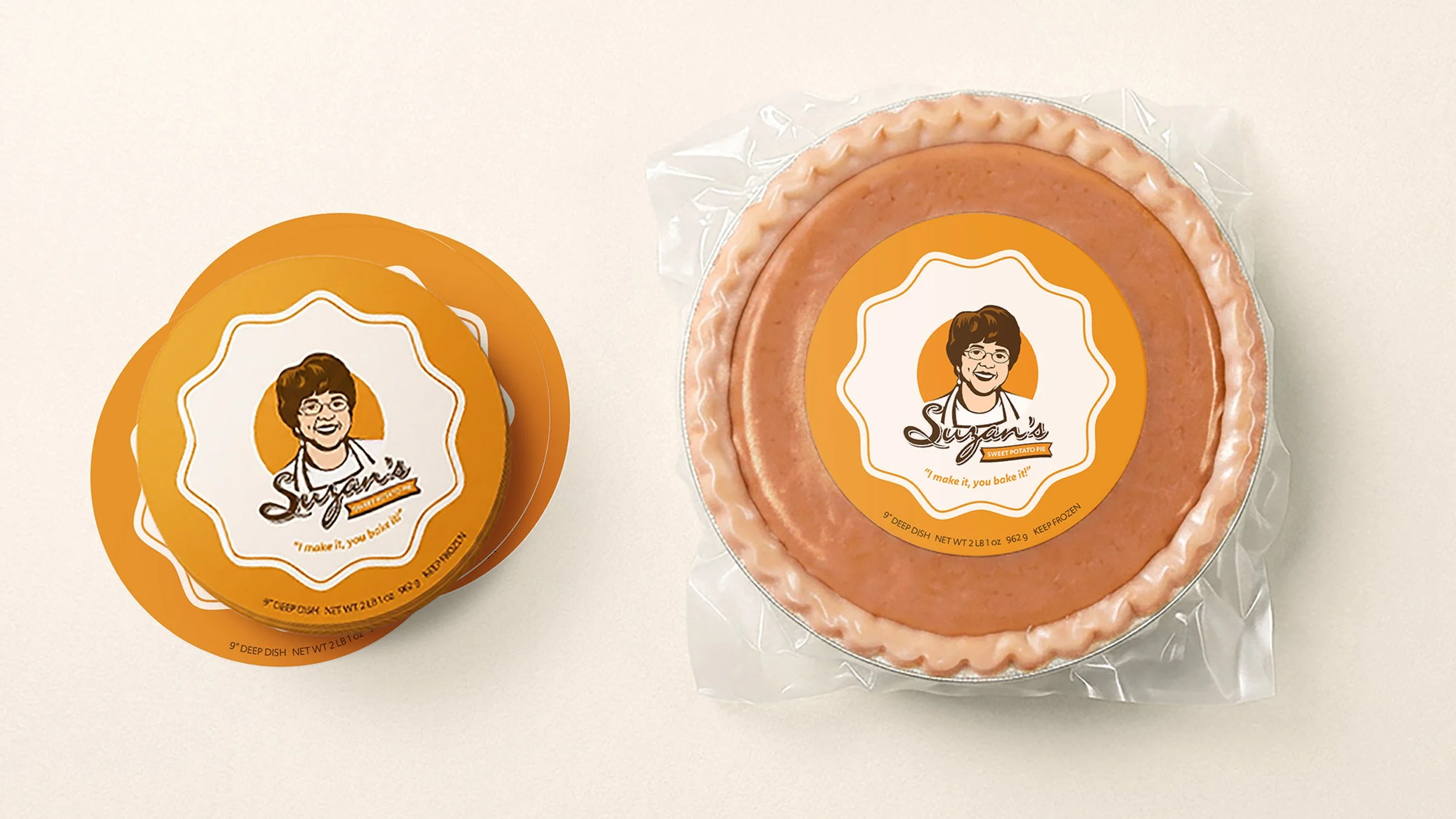
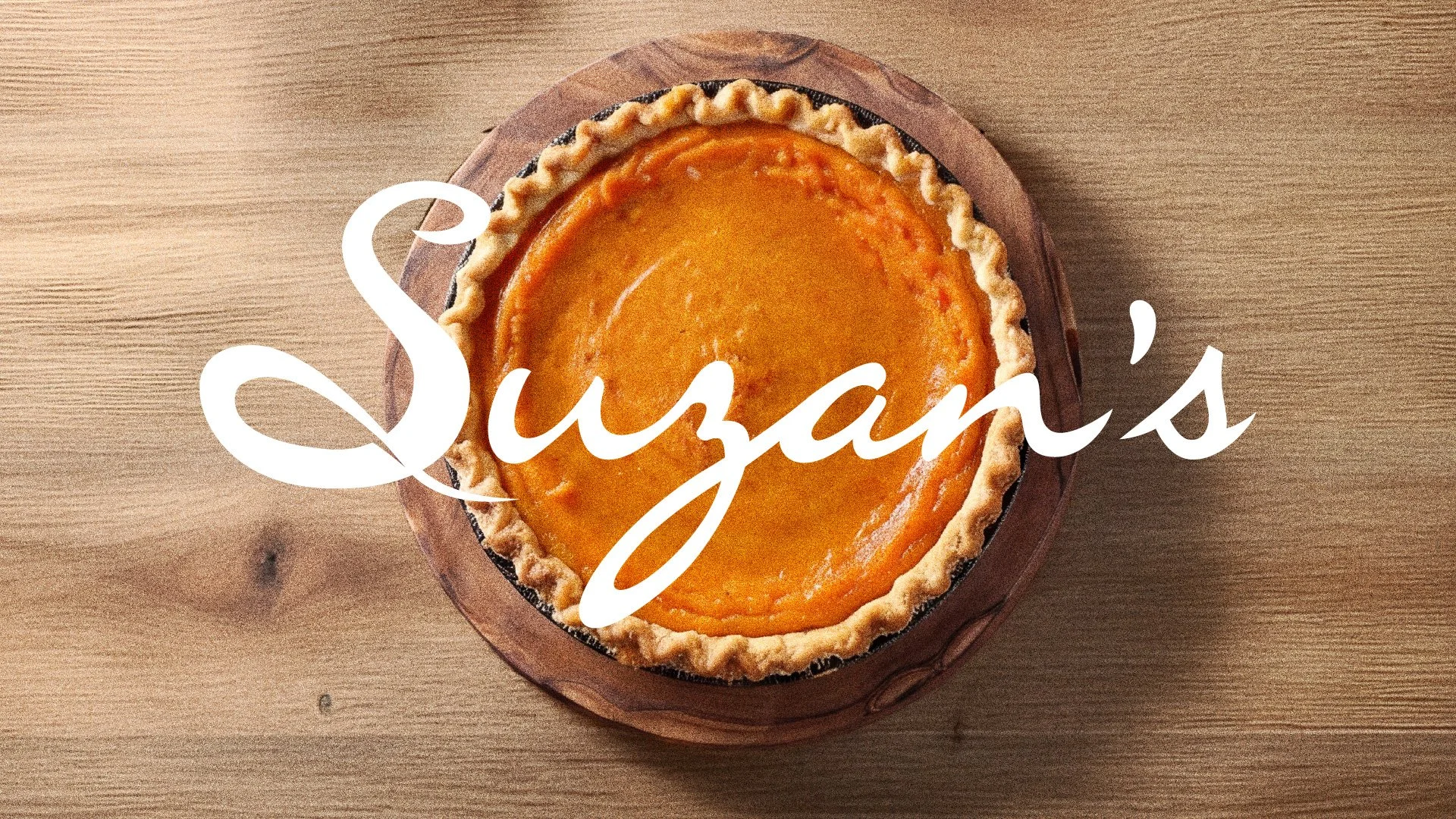
Suzan's Sweets, a word-of-mouth sensation in Omaha specifically for her sweet potato pies. But as the brand started landing on store shelves, that reputation needed something visual to back it up. The logo didn’t match the energy people were already talking about.
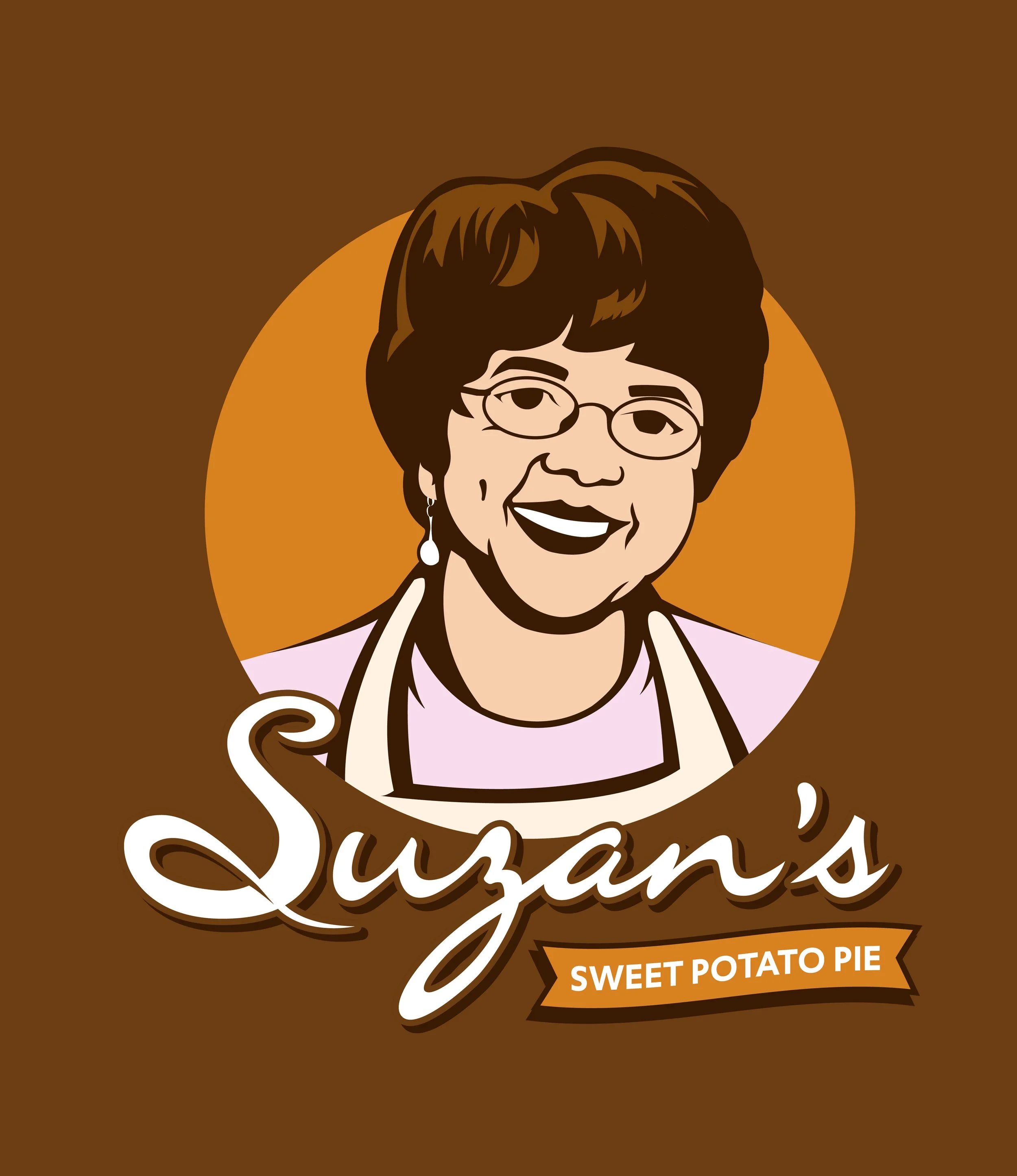
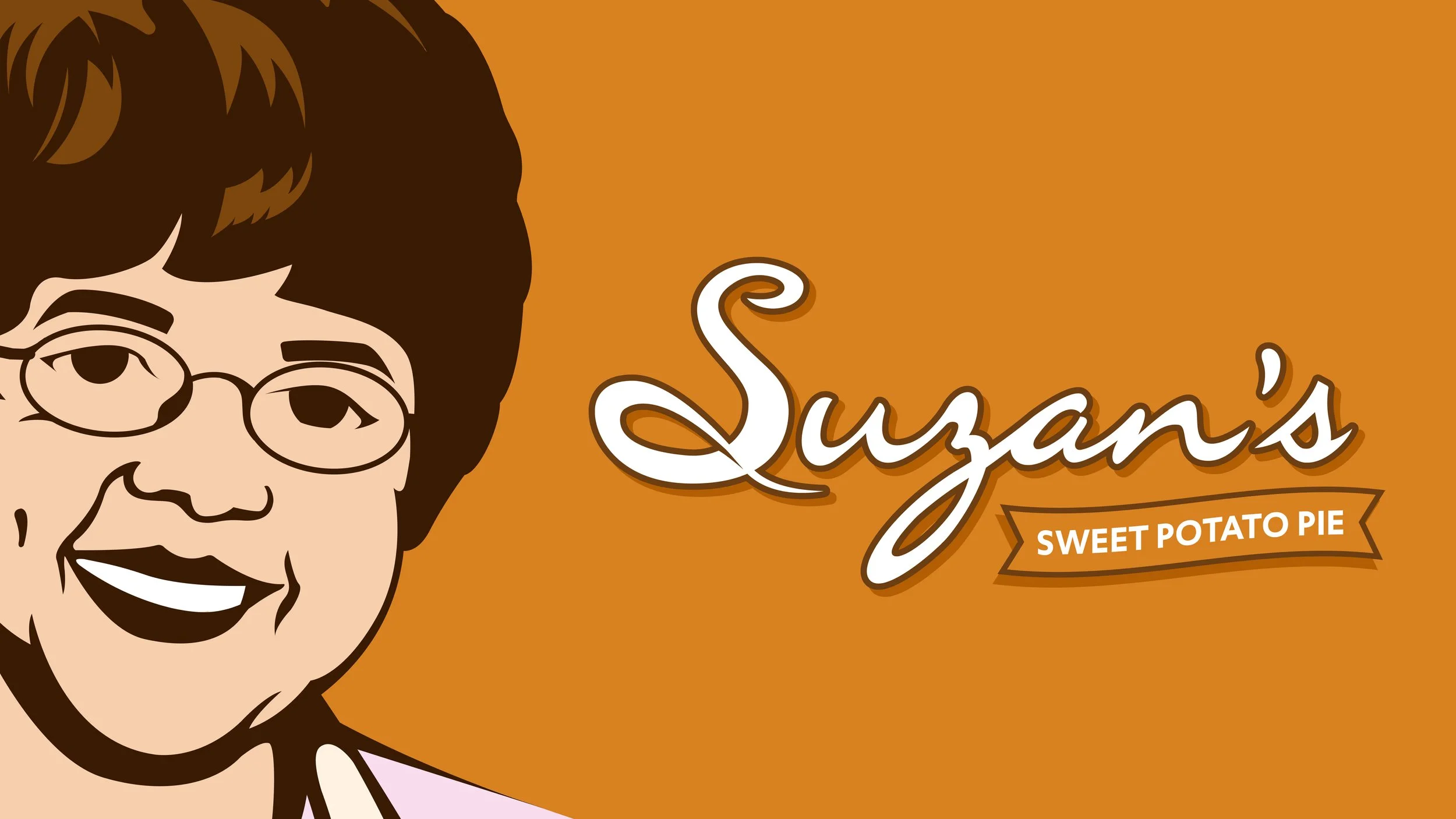
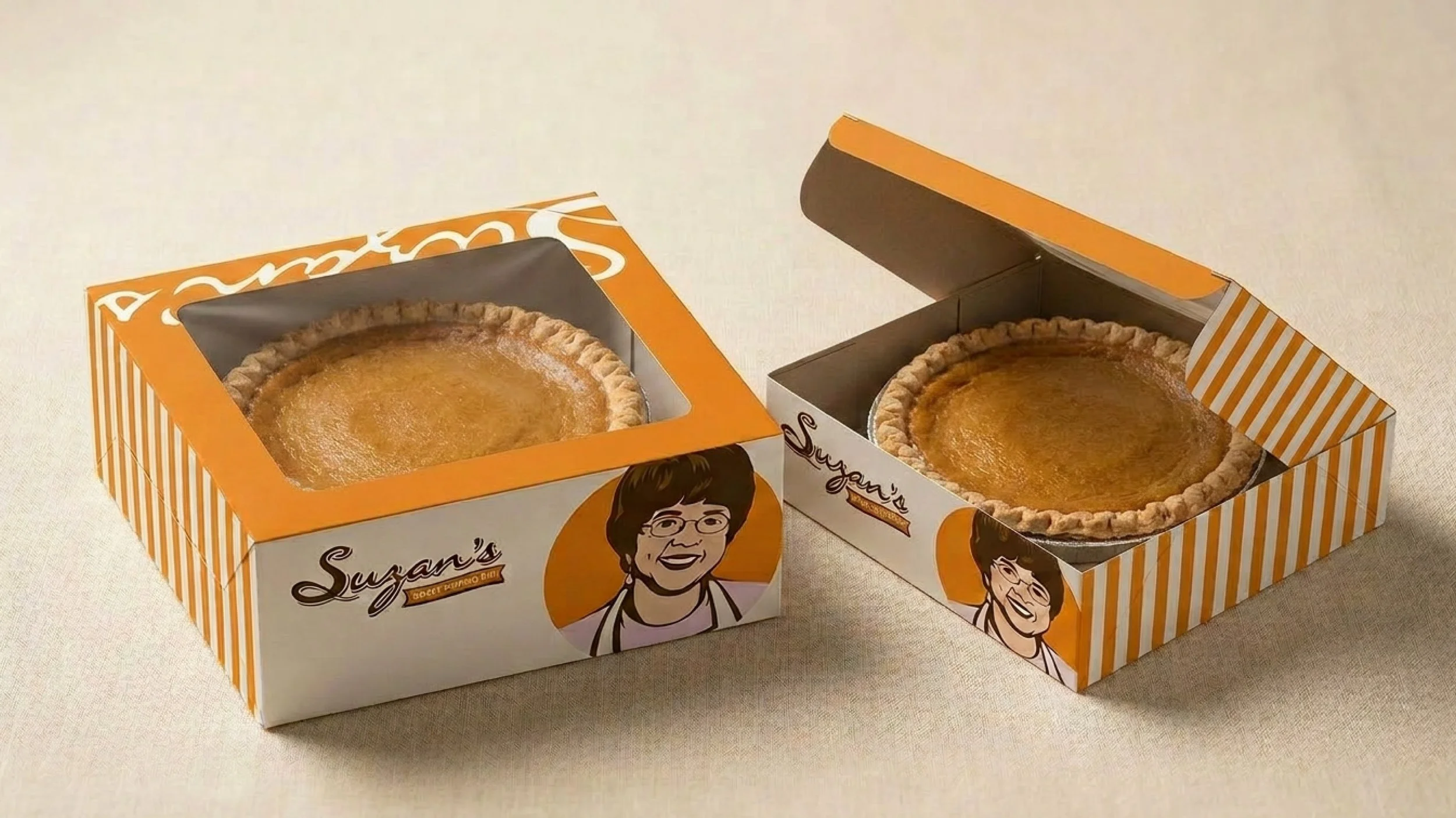
The solution was a mascot. Suzan's name was already on the product, so putting her face on it was a natural but the right next step. Consumers connect differently when there's a real person behind what they're buying.
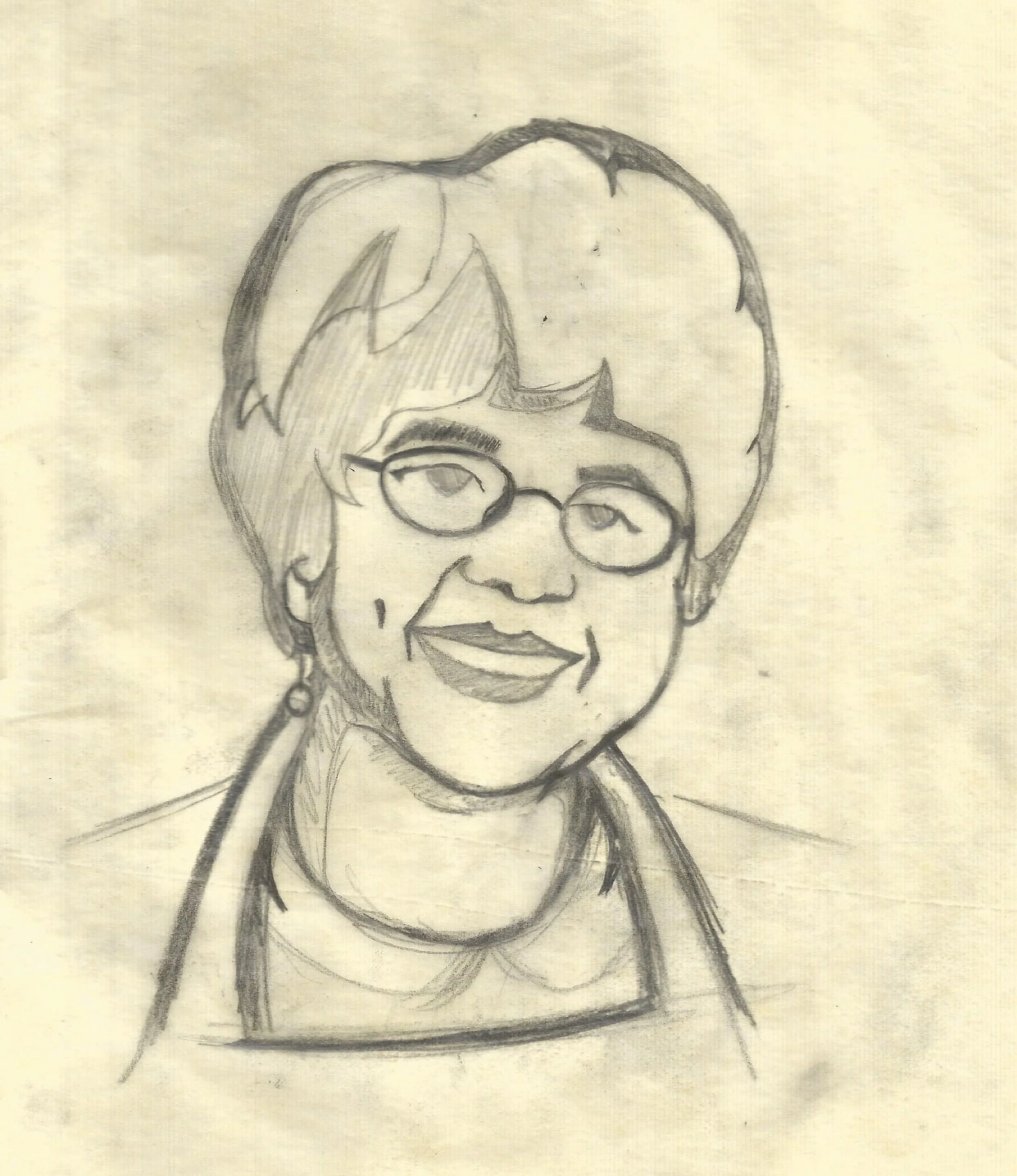
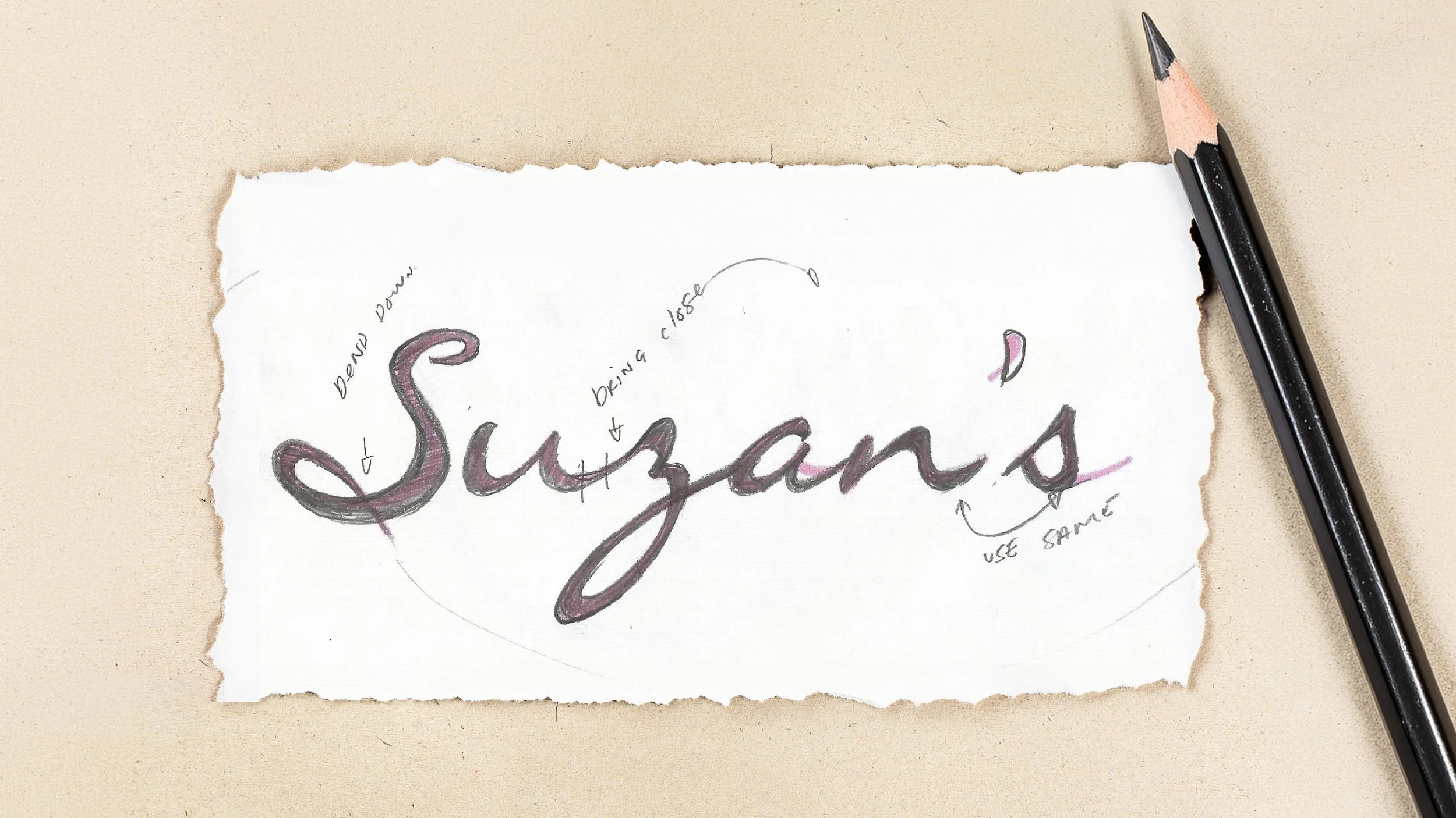
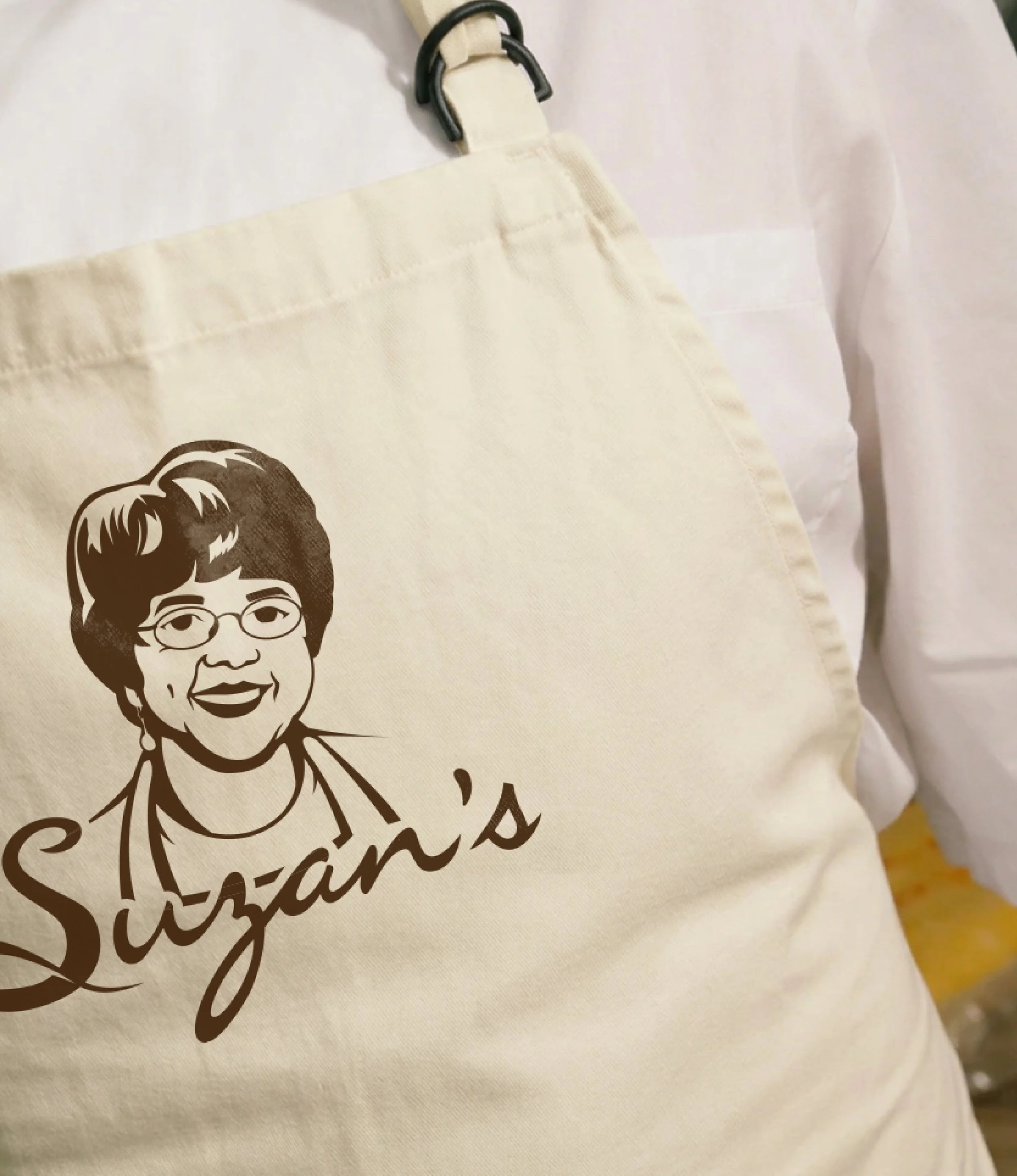
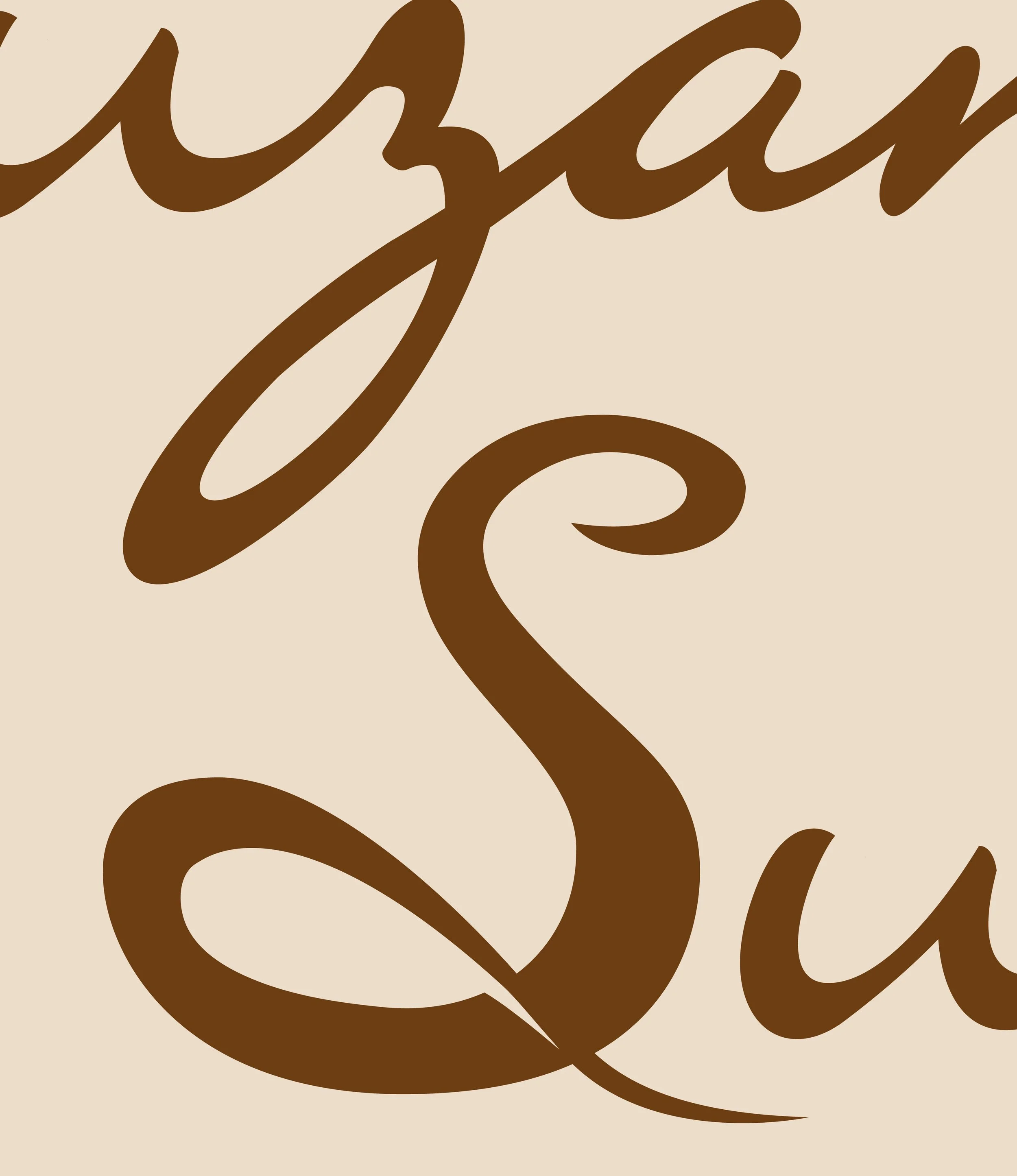
I started with a sketch, working from a photo of Suzan to get her likeness right. From there I took it into a full digital illustration. Building out the warmth and personality that already existed in the brand, just giving it a face. The apron, the smile, the script font, all of it was intentional. It needed to feel like home without feeling small.
Looking at how brands like this have used character-driven logos to shift from word-of-mouth to shelf recognition informed the direction too. Less "someone told me about this" to more "I know that face, I trust that face."